Gaurav Bhatia
Founder & Software Architect
You are probably shipping fast right now. A landing page needs to go live, a signup flow has bugs, and someone on the team says, "We will deal with accessibility later." That usually sounds reasonable until "later" becomes launch day, and real people cannot read your text, tab through your menu, or submit your form.
That is the part many startups miss. Accessibility in web design is not extra polish. It is basic usability for people who do not use the web the same way you do. If your site only works for people with perfect vision, a steady hand, and a mouse, it is not finished.
Think of it like building a shop. If the front door is too narrow, the signs are tiny, and the cashier only speaks in whispers, many customers turn around. A website works the same way. People need clear paths, readable content, and controls they can use.
Table of Contents
- Why Web Accessibility Is Your Next Growth Channel
- The Four Pillars of Web Accessibility Explained
- Practical Building Blocks for Accessible Websites
- Designing for Everyone to See and Use
- How to Test Accessibility Without a Big Budget
- Integrating Accessibility into Your Team Workflow
- Your Actionable Accessibility Checklist for Startups
Why Web Accessibility Is Your Next Growth Channel
A lot of teams treat accessibility like paperwork. They hear "WCAG," think "legal checklist," and move on to features that feel more urgent. That is a mistake. Accessibility affects whether people can buy, subscribe, book a demo, or even understand what you offer.
If people cannot use your site, they cannot become customers. They will not fill out your form if the labels are missing. They will not stay if the text blends into the background. They will not trust your product if the first interaction feels broken.
Exclusion usually looks like a normal bug
Most accessibility problems do not announce themselves. They hide inside everyday design and development choices:
- Tiny text: A user zooms in and your layout breaks.
- Mouse-only menus: A keyboard user gets stuck in the header.
- Vague buttons: A screen reader announces "click here" again and again.
- Unlabeled forms: A user hears "edit text" but has no idea what to type.
None of those issues feel dramatic while you build. But to the person using assistive tech, they can make the whole site unusable. If a person cannot complete your main task in a different way than you do, your product has a usability problem, not just an accessibility problem.
Accessibility improves more than access
When teams do accessibility work well, they usually clean up the whole product. Navigation gets clearer. Buttons behave more consistently. Content becomes easier to scan. Forms become easier to finish.
That is why accessibility in web design often helps multiple goals at once: better clarity, stronger SEO foundations, lower support friction, and more trust. Startups especially benefit because small teams cannot afford messy systems. Accessibility pushes you toward cleaner HTML, better design decisions, and reusable components that do not break under pressure.
Good accessibility fits startup speed
Teams worry that accessibility will slow delivery. In practice, ignoring it slows you down more. Retrofitting broken forms, redesigning color systems, and rewriting custom controls near launch is expensive. Doing small checks during design and development is cheaper. It is similar to correctly naming files when you start a project. It takes seconds early and wastes hours later if you skip it.
Accessibility is also a smart brand move. Startups often say they are customer-first. Accessibility makes that claim visible. You are not just saying "everyone is welcome." You are building the doors so people can get in.
The Four Pillars of Web Accessibility Explained
A startup team ships a new feature on Friday. On Monday, a customer writes in: the checkout button never receives keyboard focus, the error message is vague, and the pricing graphic makes no sense in a screen reader. The feature worked in the team's usual browser tests, but it failed real people in three different ways.
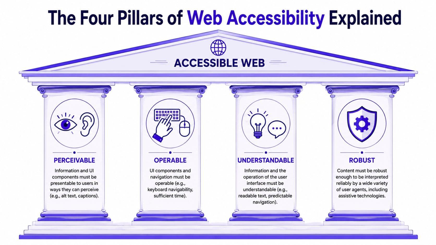
That is why the four accessibility pillars matter. They give teams a practical review frame for design critiques, sprint tickets, and component QA. If your team can check these four areas before release, accessibility becomes part of delivery instead of a cleanup project later. The model is called POUR: Perceivable, Operable, Understandable, and Compatible.
Perceivable means people can get the information
Content has to reach the user first. If someone cannot see a chart, hear a video, or distinguish text from its background, the page is blocking access before interaction even begins. For small teams, this is often the fastest place to improve. Add alt text to meaningful images. Caption videos. Make sure text contrast is strong enough to read comfortably. Do not place key instructions only in color or only inside an image.
Perceivable works like having the same message available through more than one channel. A product screenshot should include alt text that explains the feature shown. A pricing table should not appear only as an image with no text version. A tutorial video should include captions for spoken steps.
Operable means people can use the interface
Users need a reliable way to move through the page and trigger actions. That includes keyboard users, screen reader users, people using voice input, and people who need extra time or reduced motion. A quick startup-friendly test helps here. Load your page, put the mouse aside, and press Tab. You should be able to reach links, buttons, form fields, menus, and dialogs in a sensible order. You should also see where focus is at all times.
A control that responds only to a mouse click is a broken shortcut. It may look finished in a demo, but it is unfinished in production. Operable also includes motion, timing, and overlays. If a dropdown closes before someone can reach it, or a modal traps focus in the wrong place, the interface becomes harder to use even if it looks polished.
Understandable means people know what to do
Clear interfaces reduce hesitation. Labels should match the action. Navigation patterns should stay consistent. Error messages should explain the problem and the fix. This pillar is easy to miss in fast product cycles because teams know their own product too well. A developer may understand that "Continue" means "Log in," but a first-time user has to stop and interpret it. Those small moments add up.
Good understandable design sounds specific. "Password must include at least one symbol" is clear. "Input error" is not. The search button should stay in the same place across the site. Menus should open the same way from page to page.
Compatible means it works with the tools people already use
Your site has to cooperate with browsers, screen readers, zoom settings, keyboards, mobile devices, and other assistive technology. For this reason, clean implementation matters. The code needs to communicate the truth of the interface. If something submits a form, use a real button. If something moves to another page, use a real link. If a section is navigation, mark it as navigation. Generic containers can be styled to look correct while still giving browsers and assistive tools weak or confusing signals.
For startup teams, this pillar belongs in the design system. Build components once with proper HTML, labels, states, and focus behavior. Then reuse them across features. That is far cheaper than fixing ten custom versions of the same broken dropdown later.
Practical Building Blocks for Accessible Websites
Most accessibility wins start with boring things done well. That is good news for startups, because boring things are easier to repeat than clever hacks. The first building block is structure. Use the right HTML for the right job.
Start with semantic HTML
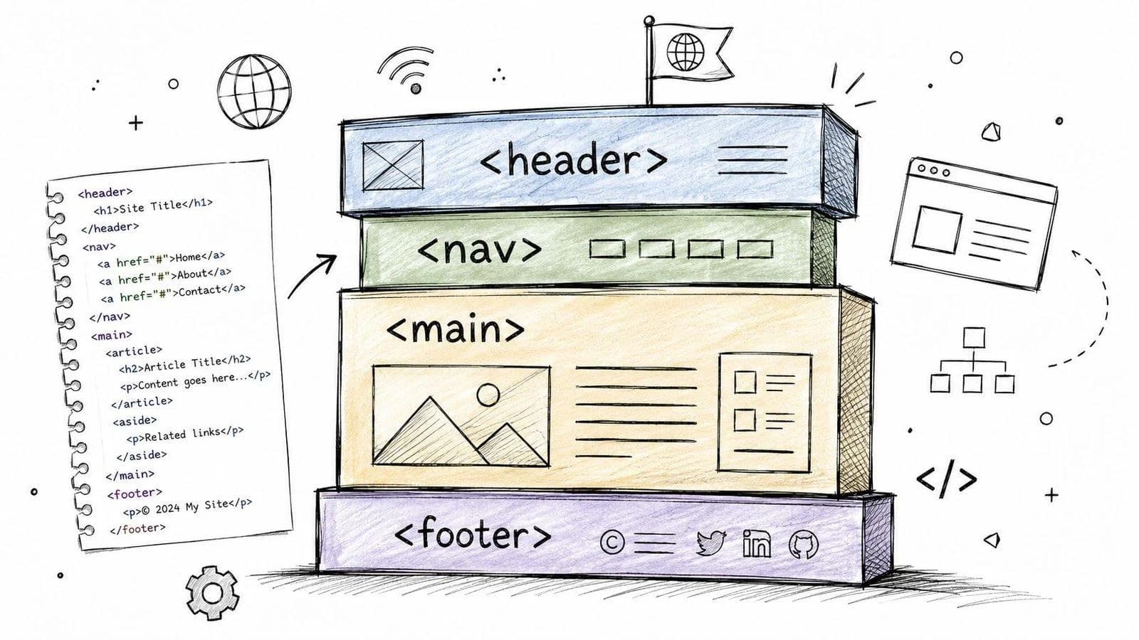
Semantic HTML means using elements that describe what they are. `<nav>` for navigation. `<main>` for the main content. `<button>` for an action. `<form>` for grouped inputs. These tags are like labeled storage boxes. They tell browsers and assistive tools what is inside.
Compare these two patterns. A div that handles clicks may look fine on screen, but it gives poor meaning. A screen reader does not get much context, and keyboard behavior often needs extra work. Now compare that to a `<nav>` with a real `<button>` that has `aria-expanded` and `aria-controls`, or a `<form>` with a `<label for="email">` connected to an `<input id="email" type="email">`. That version is clearer. Browsers understand it. Screen readers understand it. Developers who inherit your code understand it too.
If you remember one rule, remember this: buttons do things. Links go places.
<nav aria-label="Primary">
  <button type="button" aria-expanded="false" aria-controls="mobile-menu">
    Menu
  </button>
</nav>

<form>
  <label for="email">Email address</label>
  <input id="email" name="email" type="email" />
  <button type="submit">Send</button>
</form>
Use ARIA when HTML needs help
ARIA stands for Accessible Rich Internet Applications. The short version is that ARIA adds extra clues for assistive tech when native HTML is not enough. That does not mean use ARIA everywhere. It means use it carefully. A good analogy is street signs. If the road is already obvious, you do not need signs every meter. If the route is complex, signs help people understand where they are and what happens next.
ARIA is helpful for things like tabs, dialogs, accordions, and status messages. But do not use it to patch bad HTML you could have written correctly from the start. Native HTML first. ARIA second.
<div role="tablist" aria-label="Account settings">
  <button role="tab" aria-selected="true" aria-controls="panel-profile" id="tab-profile">
    Profile
  </button>
  <button role="tab" aria-selected="false" aria-controls="panel-security" id="tab-security">
    Security
  </button>
</div>

<div role="tabpanel" id="panel-profile" aria-labelledby="tab-profile">
  Profile settings content
</div>
Keyboard support is not optional
A fast manual test tells you a lot. Unplug your mouse or ignore it. Start at the top of your page and use Tab, Shift+Tab, Enter, and Space. Check these points: visible focus, logical order, reachable controls, and escape routes. Dialogs should close cleanly and return focus properly.
In React and Next.js apps, teams often break keyboard flow with custom components. A styled `div` looks polished, but it will not behave like a real control unless you add a lot of missing behavior yourself. That is why the safer path is usually to start with a real `<button>` or `<a>` and style it. A practical tomorrow-morning improvement is to audit your design system. Open your Button, Modal, Tabs, Dropdown, and FormField components. If those building blocks are accessible, product teams move faster because every new screen inherits better behavior by default.
Designing for Everyone to See and Use
A lot of accessibility problems begin before code. They begin in Figma, in a mood board, or in a quick design pass where someone picks pretty colors and assumes the browser will sort out the rest. Design choices shape whether people can read, find, and press things. This matters just as much as the HTML underneath.
Color contrast affects basic readability
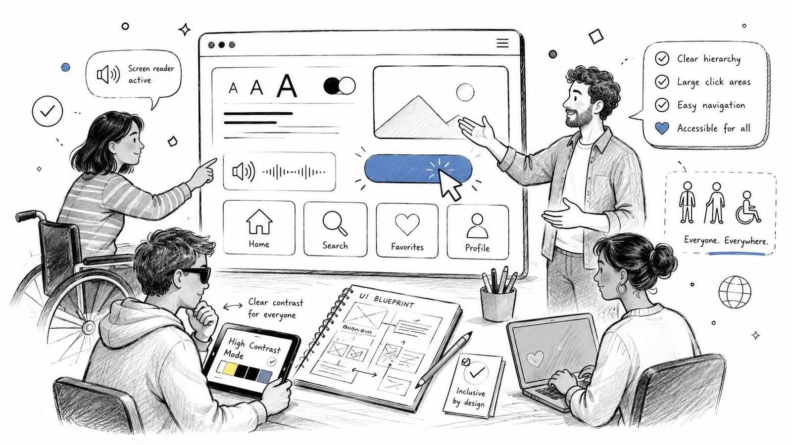
Low contrast is one of the most common problems on modern websites. Light gray text on a white card may look clean in a mockup, but many users will struggle to read it. You can catch this early with tools like Stark in Figma, the Accessibility panel in browser dev tools, or the WebAIM Contrast Checker. The exact tool matters less than the habit. Check text, icons, buttons, form borders, and error states.
- Body text: Dark text on a light background is easier to read than pale gray text on white.
- Button state: A strong color difference and clear label is easier to use than a color change only with weak contrast.
- Error message: A red border plus text explanation is clearer than a red border alone.
People also get confused by color-only meaning. If a form marks errors only with red outlines, some users will not notice what changed. Add text, icons, or helper messages so the meaning does not depend on color alone.
Zoom and responsive layout must work together
Responsive design is often treated as "does it fit on mobile?" That is too narrow. People also zoom in. They increase text size. They use browser settings that change spacing. Your layout needs to survive that. A good test is simple. Open your page and zoom in heavily. If text overlaps, buttons disappear, or horizontal scrolling appears everywhere, the layout is not holding up.
- Use flexible containers: Let content wrap instead of forcing fixed widths.
- Avoid text inside images: Real text scales better and stays readable.
- Keep tap targets roomy: Small hit areas become frustrating fast.
- Leave breathing room: Tight spacing gets worse when text grows.
Respect user settings. If someone enlarges text, they are not breaking your design. They are telling you what they need to read it. Startups can make a smart trade. Instead of designing every edge case from scratch, build a small set of accessible tokens and patterns. Define text sizes, spacing rules, focus styles, button states, and form layouts in your design system. Then reuse them everywhere. That gives designers speed without guessing, and developers fewer one-off fixes later.
How to Test Accessibility Without a Big Budget
You do not need a giant audit to start testing. You need a repeatable routine. The cheapest useful approach mixes automated checks with manual checks, because each catches different problems. If you rely only on tools, you will miss real usability issues. If you rely only on manual testing, you will waste time finding obvious mistakes a scanner could have flagged in seconds.
Automated checks find fast wins
Automated tools are like a spellchecker. They catch common issues quickly, but they do not understand the full meaning of the page. Good starter tools for small teams include axe DevTools, Lighthouse in Chrome, WAVE, and eslint-plugin-jsx-a11y for React projects. They are practical because they fit into normal work. A developer can run them in the browser, inside CI, or during local development.
These tools are useful for spotting issues such as missing alt text, weak structure, low contrast flags, and broken landmarks.
Manual checks reveal real user friction
Manual testing is where the truth comes out. A tool may say your menu passes, but a keyboard user may still get trapped inside it. A scanner may see form labels, but a real user may still find the instructions confusing. Try this lightweight manual routine on every important page: tab through the page and confirm all controls are reachable; watch focus styles so you can always see your location; open and close overlays like menus, modals, and dropdowns; fill in every form and trigger validation errors on purpose; use a screen reader briefly with VoiceOver, Narrator, or NVDA to hear how the page is announced.
A short screen reader pass teaches teams a lot. You do not need to become an expert on day one. Even hearing your own navigation read aloud can reveal confusing labels and poor heading structure. Automated checks are best for catching missing alt text, weak heading structure, some label issues, and some contrast issues. Manual checks are best for catching keyboard traps, logical reading order, clear error handling, and real usability of custom components.
A lean testing routine for small teams
You can keep this simple and still get good results. Before code review, run axe DevTools or Lighthouse on the page. Before merge, tab through the main user flow. Before release, do one screen reader smoke test on the highest-value journey. After release, recheck templates and shared components when you ship UI updates. That routine is small enough for startups and strong enough to catch many avoidable problems.
Integrating Accessibility into Your Team Workflow
Accessibility sticks when it becomes a normal part of shipping. It fails when one person cares profoundly and everyone else treats it like optional cleanup. For startups, the best move is to place small checks inside work that already exists. Do not create a giant separate process unless your team can maintain it. Put accessibility where design, development, review, and QA already happen.
Put accessibility inside the sprint
Start at the ticket level. A user story should not just say "build signup form." It should include acceptance criteria that describe usable behavior. Every field and button should be reachable without a mouse. Inputs should have visible labels and helpful error text. After submit, focus should move to the right place if there is an error. Layout should still work when text is enlarged. That changes the conversation. Accessibility stops being "extra" and becomes part of the definition of done.
During pull requests, reviewers do not need to become specialists. They can look for a few high-value signs: right element choice (button vs link), form basics (labels, helper text, error states), focus visibility (no hidden or removed outlines), and custom component risk (modals, dropdowns, tabs, and menus need extra attention). If accessibility only shows up at QA, the team already waited too long.
Turn repeat work into system rules
The biggest startup advantage is reuse. If your design system and component library are accessible, every new feature starts from a better place. That means your shared components should carry good defaults. A button should have a visible focus state and correct disabled behavior. An input should have a label connection, error message slot, and hint text support. A modal should have a focus trap, close button, and focus return on close. Navigation should use landmark roles through semantic HTML and include keyboard support.
This is especially important in fast sprint cycles. Teams move quickly and copy what already exists. If the original component is weak, the weakness spreads. If the original component is solid, quality spreads instead. A practical weekly habit is to review one shared component at a time. Fix the most reused pieces first. That gives startups the best return because one improvement helps many screens at once.
Your Actionable Accessibility Checklist for Startups
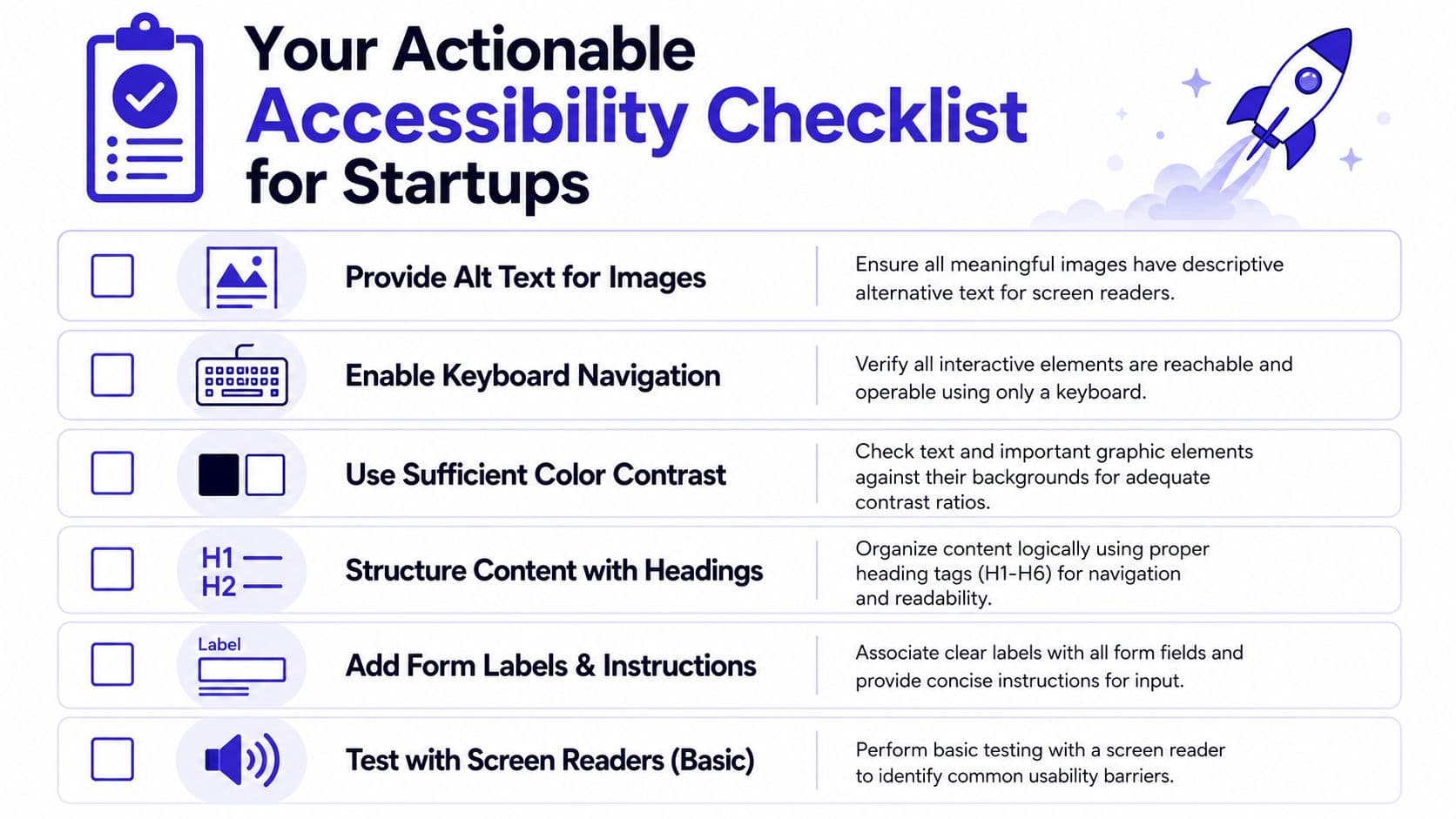
When a feature is almost ready, teams need a short pre-flight check, not a giant handbook. Use this list before launch and during sprint reviews. This quick visual can help your team keep the basics in view.
Designer pre-flight check
- Check contrast: Test text, buttons, icons, and form states in Figma with Stark or a similar plugin.
- Check scaling: Review layouts at high zoom and with larger text settings.
- Check meaning: Do not use color alone to show status or errors.
- Check consistency: Keep labels, button wording, and navigation patterns predictable.
Developer pre-flight check
- Use semantic HTML: Prefer main, nav, button, form, and proper headings over generic div wrappers.
- Label every form field: Connect labels, hints, and errors clearly.
- Support keyboards: Make sure all interactive elements work with Tab, Enter, Space, and Escape where appropriate.
- Be careful with ARIA: Add it only where native HTML does not already solve the problem.
QA pre-flight check
- Tab through the key flow: Homepage, menu, signup, checkout, booking, or whichever path matters most.
- Confirm visible focus: Users should always know where they are.
- Break the form on purpose: Trigger errors and check whether the guidance is clear.
- Do a short screen reader pass: Listen to headings, links, buttons, and form controls on core pages.
A startup does not need to fix everything in one sprint. It needs to stop shipping preventable barriers. That starts with habits like these, repeated every release.
If your team needs help turning these practices into working product habits, Technioz can support the full path from design system cleanup to accessible React, Next.js, mobile, backend, and QA workflows. We work as a single delivery partner for growing businesses that want to ship faster without leaving usability behind. Book a free consultation and we will review your current approach, identify quick wins, and help you build an accessibility roadmap that fits your stage.
Launch web and mobile apps that users love
Our app development guide covers the process, technology stack, and team approach for modern apps.
Start your web projectTechnioz services related to this article